The visual identity has a hard rule that governs every image decision: Playbook content must match or exceed the production quality of the operator’s commercial marketing. If the literacy content looks cheaper, older, or more generic than the promotional content beside it, players treat it like fine print. So photography reads like a lifestyle editorial, and illustration reads like a polished product chart — never like a compliance deck.
Photography should say “people who enjoy life and make smart choices” — never “people who might have a problem.” That single reframe is what separates this system from traditional responsible-gambling imagery.
Photo direction
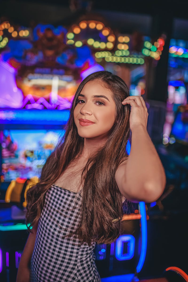
Every photograph should feel like a moment someone actually lived — never staged, never sterile. The look is editorial: cinematic or warm ambient light, a clear focal point, and real, diverse people. All subjects are clearly 21 or older, and diversity of age, ethnicity, gender, and ability is built into every shoot, not added afterward.
Light & color
Cinematic or warm ambient lighting — golden-hour and dramatic editorial both work. Color temperature stays warm (5000–6500K), leaning golden, never clinical blue-white.
Composition
Rule of thirds with a single clear subject. Leave negative space — at least 40% of a hero frame — for text overlay, and keep key subjects out of the top 15% and bottom 20% on social.
People
Diverse, candid, confident body language — people in control and enjoying themselves. Groups of 2–6, never a single isolated subject.
Mood
Confident, social, energetic, real. Never solitary, desperate, or staged. The energy is high but relaxed — fun, not frantic.
The four subject categories
Most Playbook photography falls into one of four buckets. Each has its own settings and framing, but all share the same warm, social, candid direction.
Social / Group
Friends sharing real moments — leaning in, laughing, high-fives.
Sports / Entertainment
Stadium energy and the thrill of live events — the fans, not the athletes.
Mobile / Digital
Casual, everyday device use — a quick glance, never hunched over.
Casino Environment
Upscale nightlife and social energy — never the solitary-gambler stereotype.
The lighting test
Not all low light is equal. The whole distinction is intention — cinematic lighting is deliberate and dramatic; dim lighting is just dark. A casino at night can be stunning if the photographer controlled the light; the same room shot on a phone with no flash looks seedy. The setting isn’t the problem — the lighting intent is.
Clear directional key light, well-exposed faces, deliberate highlights and shadows. The slot machines are colorful background bokeh — not the subject. Think Vogue, GQ, or a high-end hospitality campaign shot in the evening.

No key light, underexposed faces, flat uniform darkness, muddy grey-green skin tones. The feel is surveillance footage or a phone camera in a bar — dingy rather than dramatic. This fails the test.
Game & equipment imagery
Closeups of slot interfaces, card tables, roulette wheels, and chips are a useful tool — but only when they serve the content. Used purposefully, the closeup is the lesson. Used as atmosphere, generic equipment shots read as gambling promotion, not education. There is one test that decides it.
If you removed the image, would the message or CTA lose context? If yes, the closeup earns its place. If nothing changes, cut it.
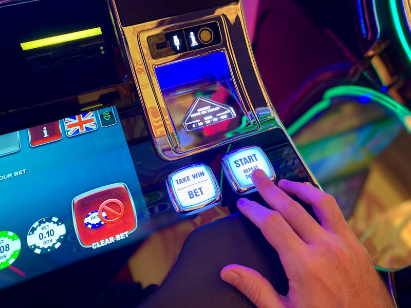
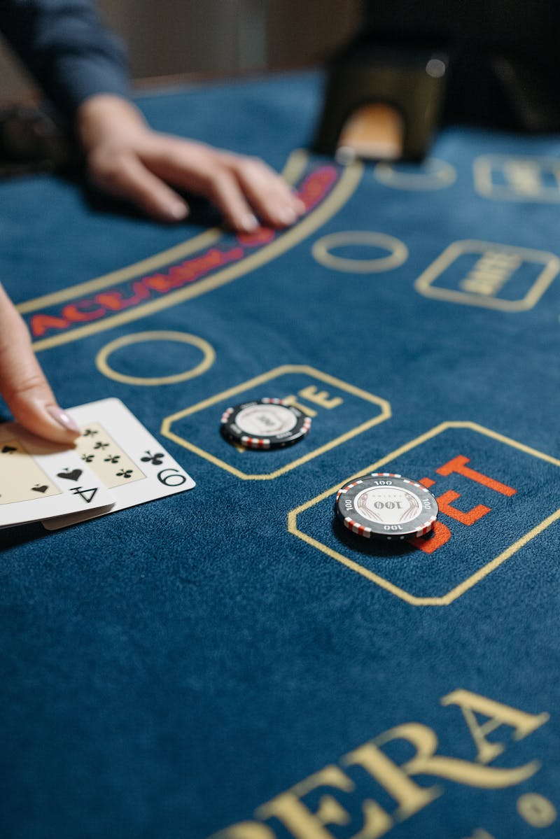
A slot interface alongside content explaining paylines or RTP; cards and chips alongside a house-edge-by-game explainer. The imagery directly teaches or supports the message.
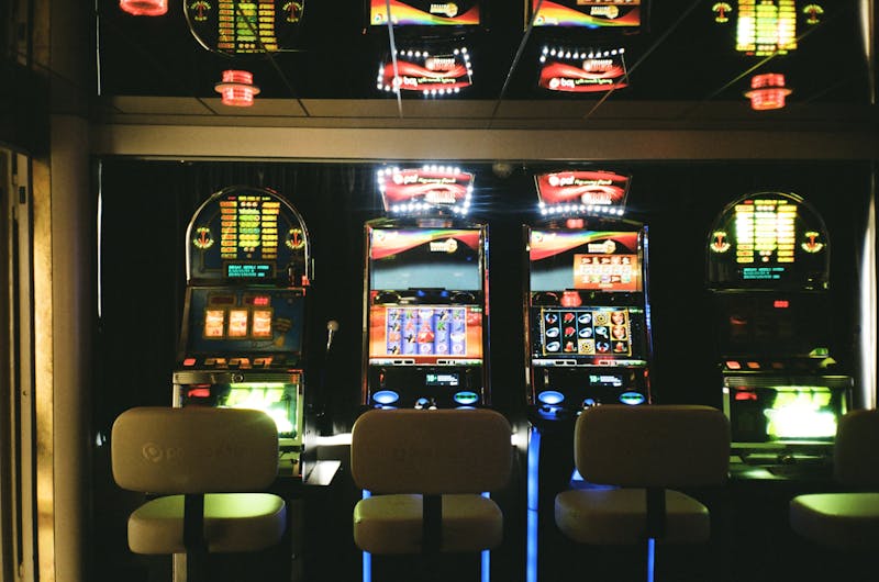
A row of slot machines with no human context, no educational framing, and no connection to a message. This is generic atmosphere that reads as promotion. Never use game equipment as the whole subject of a hero or social post.
Color grading
After grading, every photo should feel consistent with the Playbook palette — warm shadows, lifted blacks, brand-aligned tones. The navy anchors the shadows, a touch of orange warms the highlights, and skin tones are always preserved. The result is sophisticated, not oversaturated.
| Parameter | Direction |
|---|---|
| Shadows | Push toward navy #1B2838 — depth without going cold |
| Midtones | Neutral to slightly warm; preserve natural skin tones |
| Highlights | Gentle warmth; a slight orange/amber cast aligned with #FF6B35 |
| Saturation | 85–100% of natural — desaturate slightly, never oversaturate |
| Contrast | Medium-high (+10 to +20); add clarity without crushing blacks |
| Blacks | Lifted slightly — no pure black, keeps the mood open |
| White balance | Warm; adjust toward amber/yellow, never toward blue/cyan |
Cropping & aspect ratios
Compositions are planned for reuse across formats. Never crop into faces or hands in action, keep at least 10% breathing room around key subjects, and test crops at both desktop and mobile sizes before finalizing.
| Context | Ratio | Dimensions (2×) | Usage |
|---|---|---|---|
| Hero banner | 16:9 | 2560 × 1440 | Homepage hero, feature headers |
| Card image | 4:3 | 1200 × 900 | Content cards, blog previews |
| Social square | 1:1 | 1080 × 1080 | Instagram feed, social sharing |
| Story / vertical | 9:16 | 1080 × 1920 | Stories, TikTok |
| Wide banner | 21:9 | 2520 × 1080 | Email headers, wide CTAs |
Photography do & don’t
- Show real, diverse people having a genuine good time.
- Use cinematic or warm lighting — golden hour, intentional nightlife.
- Capture social moments — friends together, shared experiences.
- Show confident body language — people in control.
- Leave text-overlay space; plan compositions for design use.
- Use game closeups purposefully, when they explain mechanics.
- Show distress or desperation — no head-in-hands, empty wallets, dark rooms.
- Reinforce “problem gambler” stereotypes or solitary play.
- Use generic stock that looks like a compliance deck.
- Pair alcohol with gambling content, or include anyone under 21.
- Glamorize high-stakes play — no big chip stacks or cash close-ups.
- Use cold blue grading, heavy HDR, or Instagram-style filters.
In support, self-exclusion, and reactivation contexts, the direction flips: calm human warmth with no gambling context at all — hands holding a coffee, quiet morning light, open spaces. The test becomes “if a player in crisis sees this, does it feel like a safe place?” When in doubt, omit the photo and let typography and white space carry the screen. This pairs with the warmer register described in Voice & Tone.
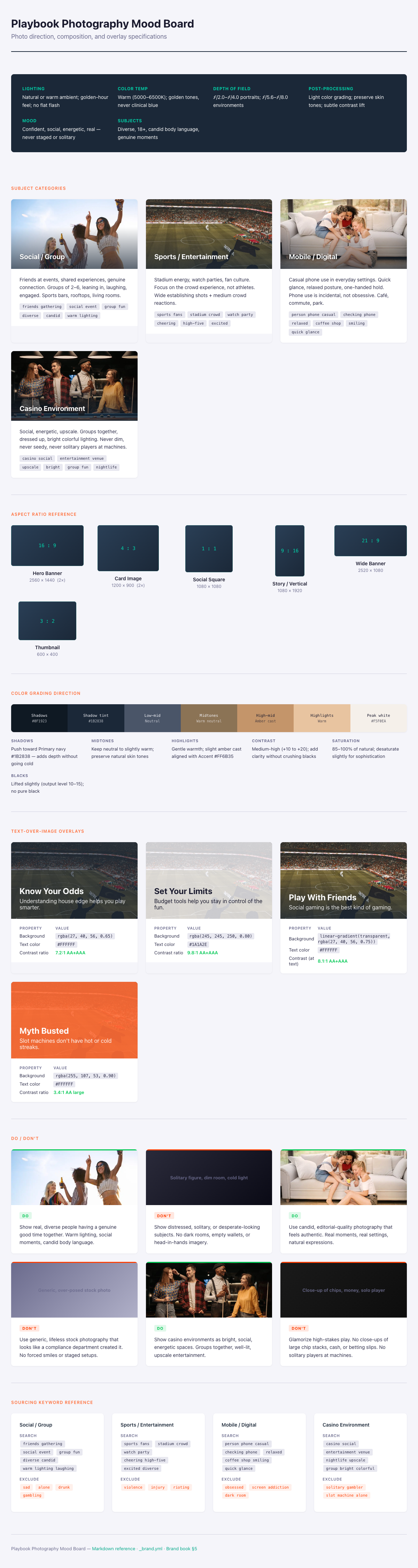
The photography mood board — the target visual direction: warm, social, cinematic, real.
Illustration style
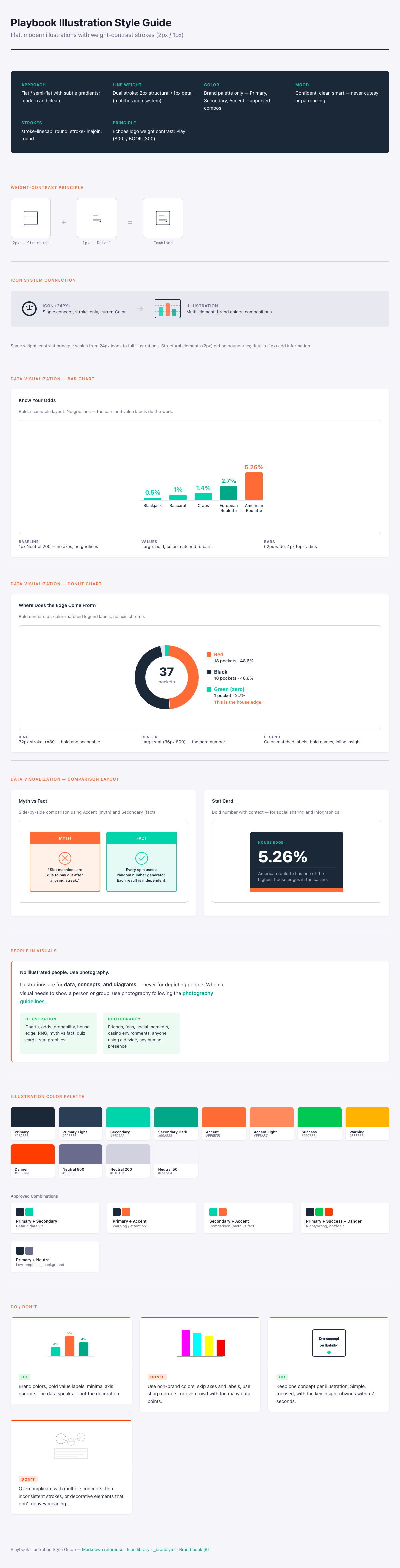
Where photography carries people, illustration carries the abstract — odds, probability, house edge, how RNG works. The style is flat, modern, and clean, and it is deliberately tied to the icon system through a shared weight-contrast principle: structural elements use a 2px stroke, details use 1px. That 2:1 ratio echoes the logo’s Play (heavy) / BOOK (light) contrast and ties every visual back to the wordmark.
Approach
Flat or semi-flat with subtle gradients — simple enough to read at small sizes, detailed enough to be engaging.
Stroke
Dual weight — 2px structural outlines, axes, and borders; 1px data lines and annotations. Round caps and joins; strokes are always solid.
Color
Brand palette only — navy, teal, and orange plus approved combinations. Solid fills or subtle linear gradients between adjacent colors.
Any visual that depicts a person or group of people uses photography — no exceptions. Illustration is exclusively for data, concepts, and diagrams. There are no illustrated people in this system.
Illustration or photography?
When you’re unsure which medium a visual calls for, the split is consistent: real human emotion is always a photo; structured data and abstract concepts are always an illustration.
| Scenario | Use | Why |
|---|---|---|
| Explaining odds or probability | Illustration | Abstract concept; needs visual simplification |
| Showing how RNG works | Illustration | A technical process that can’t be photographed |
| House-edge comparison by game | Illustration | Structured data needs charts, not photos |
| Myth vs. fact comparison | Illustration | Side-by-side structured layout |
| Social gaming moments | Photography | Real human emotion and connection |
| Casino atmosphere | Photography | An authentic setting conveys credibility |
| Hero banners / landing pages | Photography | Emotional impact and aspirational feel |
The illustration style guide — flat data viz, concept diagrams, and brand-palette charts in one consistent language.
Data-visualization rules
Most Playbook illustration is data visualization — the charts that turn a house edge or a set of odds into something a player grasps in two seconds. These are designed to look like marketing collateral, not a scientific paper. The key insight should be obvious at a glance, and the chart must stay legible at 300px wide.
Bar charts
- Minimum bar width 40px, with generous gaps between bars.
- Value labels in Inter 700, 18px, color-matched and sitting above each bar — the labels are the data.
- No Y-axis, no gridlines, no tick marks — keep it clean for marketing use.
- Maximum 5–6 bars per chart; split into multiple charts if you have more.
- Always start at zero — never truncate the scale to exaggerate a difference.
Donut charts
Rendering
Stroke-based rings, not filled wedges — consistent with the stroke-first language. Stroke width 28–32px, 50% inner radius, a ~2px gap between segments, and a maximum of five segments (group the rest into “Other”).
The hero number
The key stat sits in the center in Inter 800, 36px — that’s the takeaway. The legend goes beside the chart with bold, color-matched labels and a short line of insight. No axis chrome, no gridlines.
When color is the only thing telling two series apart, choose a safe pair — navy + teal, navy + orange, or teal + orange all read across the common forms of color blindness. For red/green right-vs-wrong comparisons, add a pattern fill (diagonal lines, dots) on top of color, because green-and-red alone fails for deuteranopia.
Illustration do & don’t
- Use the brand palette exclusively — every color comes from the approved set.
- Maintain weight contrast — 2px structure, 1px detail.
- Start every axis at zero; keep proportions mathematically accurate.
- Label clearly, assuming zero domain knowledge from the viewer.
- Make the key insight visible in two seconds; test at 300px wide.
- Keep one concept per illustration, with a consistent set style.
- Use colors outside the palette, or create photorealistic illustrations.
- Truncate a scale to exaggerate a difference — that’s a misleading chart.
- Overcomplicate — no decorative elements that carry no information.
- Use cutesy or childish styles; the audience is adult and the tone is confident.
- Mix illustration styles across a set.
- Ever draw people — that’s photography’s job.
Both media report to the same final check the brand book calls the visual integration test: place the work next to the operator’s commercial content, and ask whether a CMO would put their name on it. If it looks like a compliance department made it, redesign. For how this sits inside the full system, see Color and Iconography.