Playbook's type system uses three variable fonts from Google Fonts: broad availability, zero licensing cost, and a contemporary aesthetic. Each font has one job. Inter sets every heading, label, and the logo. Source Sans 3 carries the reading — paragraphs, descriptions, form copy. Source Code Pro handles anything a player has to read precisely: helpline numbers, odds, and data. The same discipline that shapes the color palette shapes the type — it should look like it belongs on a gaming platform, not a pamphlet.
Minimum body text is 16px — no exceptions. Accessibility requires it, and content people are meant to read should be readable. The 12px caption size exists for legal lines only.
The three font families
Each typeface is chosen for a specific reason, and the reasons are worth keeping when adapting the system to an operator brand.
Headings, UI, logo
Inter
Know your game.
Designed for screens. Excellent x-height, clear at small sizes, and a weight range broad enough to carry the logo — Play at 800 against BOOK at 300.
Weights 300, 400, 600, 700, 800, 900
Body text
Source Sans 3
Every game has math. Here is yours, in plain language.
Adobe's open-source workhorse — highly readable for long-form content and comfortable at 16–18px body sizes.
Weights 300, 400, 600
Data, odds, helplines
Source Code Pro
1-800-522-4700 · RTP 96.5% · 1 : 37
A monospaced companion that fully disambiguates 0/O and 1/l/I — essential for helpline numbers a player must dial correctly.
Weights 400, 500, 600
All three are licensed under the SIL Open Font License and ship as self-hosted variable WOFF2 files, so rendering stays consistent without depending on an external CDN.
The type scale
Nine steps on a 16px base, from a 48px display headline down to a 12px caption. The specimen below renders each level at its real size — the size, weight, and spacing beside each line are the actual specifications.
Display and H1 use a tight tracking of -0.02em to keep large headlines from feeling loose; everything from H2 down sits at normal tracking. Body line-height is a generous 1.6 for comfortable long-form reading.
The full specimen
The complete reference sheet, showing every family at every weight and size in context.
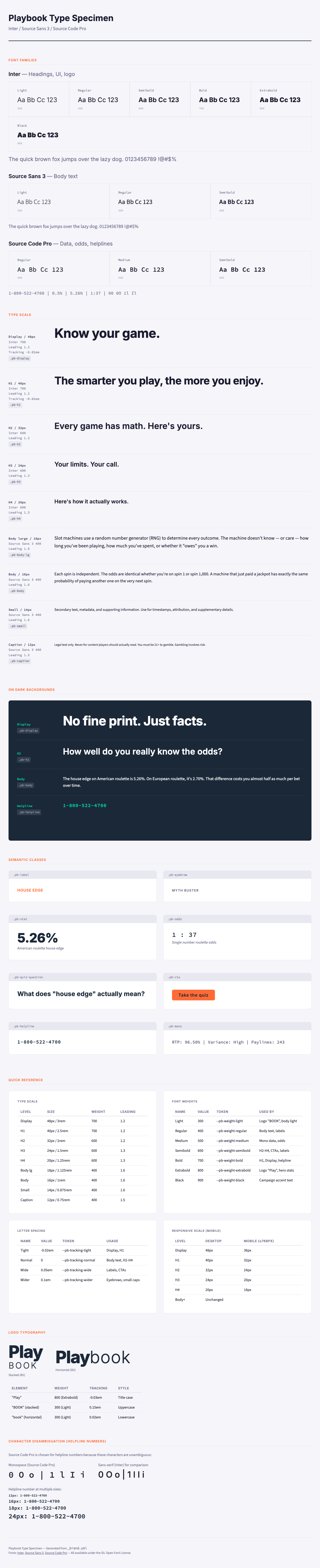
Responsive scale
On viewports of 768px and below, headings step down so a display headline does not force horizontal scrolling. Body sizes never change — 16px stays 16px everywhere.
| Level | Desktop | Mobile (≤768px) |
|---|---|---|
| Display | 48px | 36px |
| H1 | 40px | 32px |
| H2 | 32px | 24px |
| H3 | 24px | 20px |
| H4 | 20px | 18px |
| Body and below | unchanged | unchanged |
Font weights
Seven weights, each with a defined job. The extremes matter most: 800 and 300 create the logo's Play-versus-BOOK contrast, and 500 is reserved for monospaced data so odds and RTP values read cleanly.
| Name | Value | Primary usage |
|---|---|---|
| Light | 300 | Logo "BOOK" half, body light |
| Regular | 400 | Body text, form labels |
| Medium | 500 | Mono data displays, odds |
| Semibold | 600 | H2–H4, CTAs, labels, UI |
| Bold | 700 | H1, Display, helpline numbers |
| Extrabold | 800 | Logo "Play" half, hero statistics |
| Black | 900 | Campaign accent headlines |
Purpose-built classes
The drop-in stylesheet bundles font, size, weight, leading, and tracking into single-purpose classes for the content patterns Playbook uses constantly — a hero stat, an odds display, a helpline number. Reach for these instead of restyling from scratch, or see them rendered live in the interactive Brand Book.
| Class | Description | Specification | Example |
|---|---|---|---|
.pb-stat | Hero data number | Inter 800 · 48px | 5.26% |
.pb-odds | Odds display | Source Code Pro 500 · 24px | 1 : 37 |
.pb-quiz-question | Quiz heading | Inter 700 · 24px | What does house edge mean? |
.pb-helpline | Helpline number | Source Code Pro 600 · 18px | 1-800-522-4700 |
.pb-cta | Button text | Inter 600 · 16px | Take the quiz |
.pb-label | Uppercase label | Inter 600 · 14px | HOUSE EDGE |
.pb-eyebrow | Tiny uppercase | Inter 600 · 12px | MYTH BUSTER |
Helpline numbers always use .pb-helpline — Source Code Pro at 600. In a proportional font, 1, l, and I can blur together, as can 0 and O. For a number someone may dial in a stressful moment, that ambiguity is unacceptable. The mono face spells it out unmistakably.
Typography rules
Six rules govern how the system is applied. They are short on purpose.
Readability
- Minimum body text 16px. No exceptions.
- Line length 50–75 characters. Wider lines reduce readability.
- Paragraph spacing of 1em — one blank line between paragraphs.
Alignment and exceptions
- Left-aligned always. Justified text creates uneven word spacing.
- Helpline numbers in mono — never a font where 1/l/I or 0/O blur.
- 12px caption for legal lines only — never for content players should read.
Adapting the type system
When an operator swaps in their own fonts, the goal is to match their commercial typography's quality while preserving what makes the system work.
- Choose fonts with broad weight support — at minimum a regular and a bold, ideally the full range.
- Match the operator's modernity. Playbook content should feel as current as the marketing around it.
- Cover your jurisdictions' character sets. Confirm the font supports every language you publish in.
- Test at small sizes. Literacy content often lands in tight spaces — verify it stays legible.
- Preserve the logo contrast. If you replace Inter, the heading font still needs a weight of 700 or heavier and one of 300 or lighter for the Play-versus-BOOK effect.
Type and color set the visual foundation; the words that fill the type come from the Voice & Tone chapter and the Messaging Library.